Switter.su
  • Communities
  • Create Post
  • Create Community
  • heart
    Support Lemmy
  • search
    Search
  • Login
  • Sign Up
mitpatel7@lemmy.world to Android (locked, see pinned thread)@lemmy.worldEnglish · 2 years ago

New Android logo

lemmy.world

message-square
42
fedilink
196

New Android logo

lemmy.world

mitpatel7@lemmy.world to Android (locked, see pinned thread)@lemmy.worldEnglish · 2 years ago
message-square
42
fedilink
alert-triangle
You must log in or register to comment.
  • OdinsonThor@lemmy.ca
    link
    fedilink
    English
    arrow-up
    64
    ·
    2 years ago

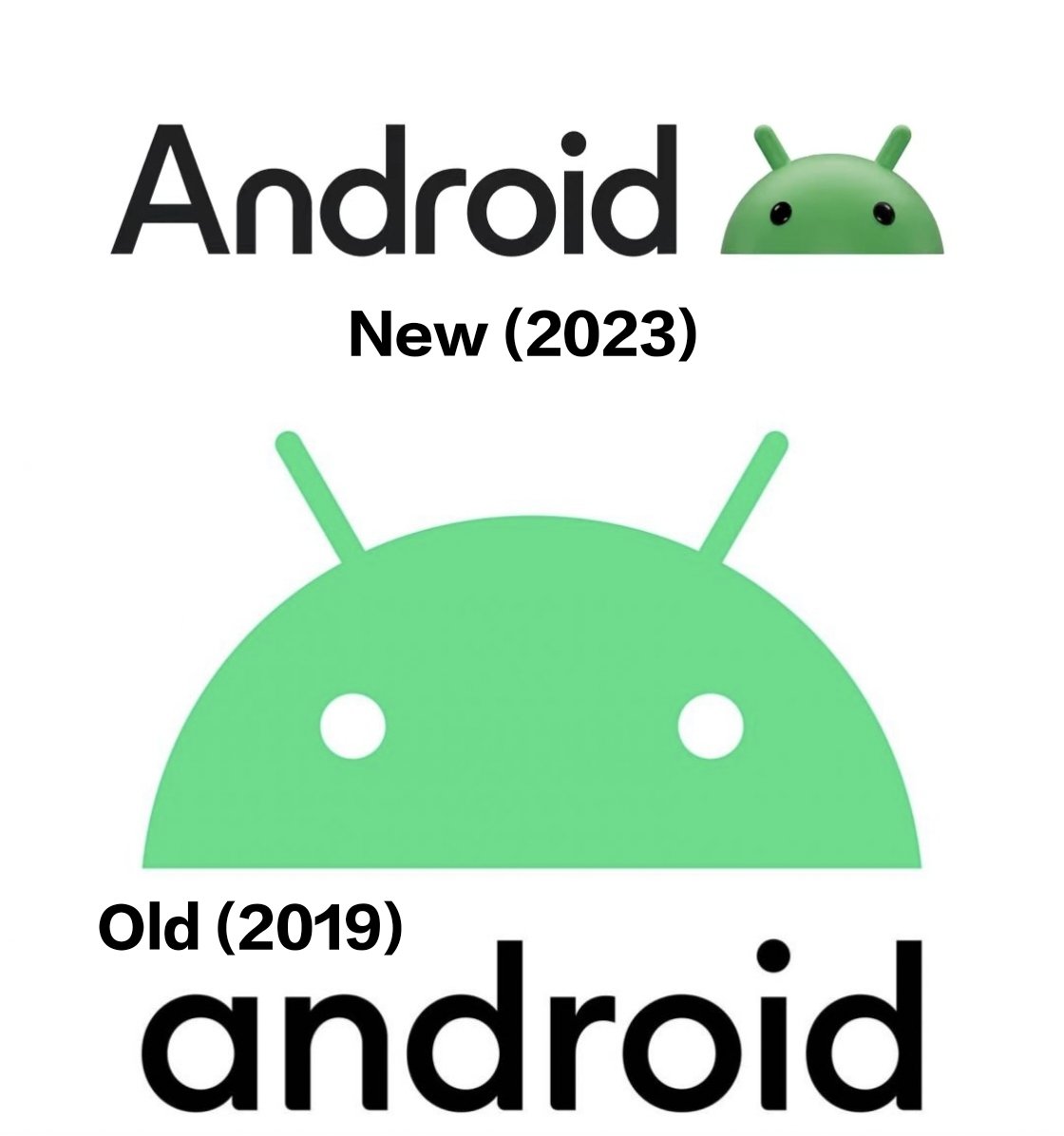
    I think I actually prefer the simplicity of the old one. In general, I find logos with too many textures a little distracting or “noisy”

    • lorez@lemm.ee
      link
      fedilink
      English
      arrow-up
      4
      ·
      2 years ago

      Same.

  • WorldlyIntrospection@lemmy.world
    link
    fedilink
    English
    arrow-up
    63
    arrow-down
    1
    ·
    2 years ago

    Can we make up our minds, please?
    In the 90s-2000s we had these shaded, almost 3D icons everywhere. Then we transitioned to a flat, minimalist style.
    Give us something new and exciting instead of capitalizing on “retro nostalgia”

    • Captain Aggravated@sh.itjust.works
      link
      fedilink
      English
      arrow-up
      14
      ·
      2 years ago

      The 2000’s were very…amorphous. Like, remember the Cingular Wireless blob dude? Or the MusicMatch logo? Not the black and white jagged thing, the orange blob and blue bigger blob? And how all personal electronics were strange plastic shapes painted silver and purplish-blue? And the world hadn’t gone insane yet?

      • andrew@lemmy.stuart.fun
        link
        fedilink
        English
        arrow-up
        6
        ·
        2 years ago

        The world had gone insane, just in less malicious ways. Blob dude, for instance.

        https://youtu.be/9uX_kAIkikQ

    • platysalty@kbin.social
      link
      fedilink
      arrow-up
      4
      arrow-down
      1
      ·
      2 years ago

      Yeah, I was like “what new logo?”. I remember when the 2D logo was new and the 3D one was old.

  • FairLight@lemmy.world
    link
    fedilink
    English
    arrow-up
    34
    ·
    2 years ago

    The new one looks like a serious downgrade, imo

    • Lucidlethargy@sh.itjust.works
      link
      fedilink
      English
      arrow-up
      15
      ·
      2 years ago

      Yup. I don’t like it.

  • InverseParallax@lemmy.world
    link
    fedilink
    English
    arrow-up
    25
    ·
    2 years ago

    As a longtime android user, thank God they’re finally listening and focusing on the most important problems!!!

  • Leclipse@lemmy.world
    link
    fedilink
    English
    arrow-up
    24
    ·
    2 years ago

    Is this serious?? Or is this a meme??

    • Lka1988@sh.itjust.works
      link
      fedilink
      English
      arrow-up
      4
      ·
      2 years ago

      Looks legit

      https://9to5google.com/2023/06/30/new-android-wordmark-logo/

  • 🇰 🔵 🇱 🇦 🇳 🇦 🇰 ℹ️@lemmy.world
    link
    fedilink
    English
    arrow-up
    22
    ·
    edit-2
    2 years ago

    Bottom: RTX off

    Top: RTX on

  • qtieπ@sh.itjust.works
    link
    fedilink
    English
    arrow-up
    22
    arrow-down
    2
    ·
    2 years ago

    Not really into the 3d aesthetic sorry, still too 2010ish for me

  • sup@lemmy.ca
    link
    fedilink
    English
    arrow-up
    21
    arrow-down
    2
    ·
    edit-2
    2 years ago

    I might be in the minority, but ignoring the actual design, I’m hopeful that the trend of flat design is coming to an end. Wasn’t really a big fan of that.

    • knaugh@frig.social
      link
      fedilink
      English
      arrow-up
      11
      arrow-down
      1
      ·
      2 years ago

      I’m with you, but it is a bit odd for android given the push for material design

    • Rentlar@lemmy.ca
      link
      fedilink
      English
      arrow-up
      9
      ·
      2 years ago

      I like skeumorphism done right over material design (the trend of making everything into basic shapes makes me attribute to graphic designer laziness over anything).

      BUT, I wouldn’t want it to be like fashion where every 2 years it flips between flat, simple, material design being what’s hot then the next two years, complicated and glossy icons become the norm.

  • Bakeri666@lemmy.world
    link
    fedilink
    English
    arrow-up
    19
    ·
    2 years ago

    Giving up on Material already? But we are only half way through the You upgrade.

    I get the feeling Google aren’t very joined up

    • cyanarchy@sh.itjust.works
      link
      fedilink
      English
      arrow-up
      6
      ·
      2 years ago

      What has Google ever done to make you think the left hand knows a right hand exists?

  • Indépendantiste@lemmy.world
    link
    fedilink
    English
    arrow-up
    19
    arrow-down
    1
    ·
    2 years ago

    This leads me to think that Google is planning on an AR/VR product like the Vision Pro and so they want to make 3D icons and UI elements more prominent (to make the transition easier, the same reason we had 3D icons at the start of computers and smartphones as well), kind of like what Apple did in the last 2-3 years with their new Icons (like on MacOS, they added back a lot of depth with Big Sur)

    • ayyndrew@lemmy.world
      link
      fedilink
      English
      arrow-up
      4
      ·
      2 years ago

      They are working on an AR platform with Samsung

    • kingthrillgore@kbin.social
      link
      fedilink
      arrow-up
      1
      ·
      2 years ago

      They aren’t. They literally just axed their third go at an AR product.

  • shotgun_crab@lemmy.world
    link
    fedilink
    English
    arrow-up
    18
    ·
    2 years ago

    Are we going back to older, more detailed logos?

  • Yubishi@lemmy.one
    link
    fedilink
    English
    arrow-up
    13
    ·
    2 years ago

    What is old is new again.

  • Tywèle [she|her]@lemmy.dbzer0.com
    link
    fedilink
    English
    arrow-up
    14
    arrow-down
    1
    ·
    2 years ago

    I prefer the flat looking one. Never liked skeumorphism icons.

  • devious@lemmy.world
    link
    fedilink
    English
    arrow-up
    13
    ·
    2 years ago

    I don’t know how I feel about the move from a flat logo back to the old shaded, gradient 3D look, but I am definitely a fan of the font!

  • PrincePew@lemmy.world
    link
    fedilink
    English
    arrow-up
    12
    arrow-down
    1
    ·
    2 years ago

    Here, use this instead.

    • InverseParallax@lemmy.world
      link
      fedilink
      English
      arrow-up
      4
      ·
      edit-2
      2 years ago

      That’s actually a lot better :/

Android (locked, see pinned thread)@lemmy.world

android@lemmy.world

Subscribe from Remote Instance

You are not logged in. However you can subscribe from another Fediverse account, for example Lemmy or Mastodon. To do this, paste the following into the search field of your instance: !android@lemmy.world
lock
Community locked: only moderators can create posts. You can still comment on posts.

This community has been locked by its moderators, with the decision that we will reunite at c/Android at Lemdro.id.

See this thread for the full announcement: https://lemmy.world/post/1117612

Visibility: Public
globe

This community can be federated to other instances and be posted/commented in by their users.

  • 20 users / day
  • 20 users / week
  • 19 users / month
  • 462 users / 6 months
  • 0 local subscribers
  • 0 subscribers
  • 174 Posts
  • 4.19K Comments
  • Modlog
  • mods:
  • Devgard@lemmy.world
  • Mike Stevens 🇦🇺@lemmy.world
  • BE: 0.19.10
  • Modlog
  • Instances
  • Docs
  • Code
  • join-lemmy.org